Stack Overflow
I joined Stack Overflow in 2016 as a product designer on their Teams and Enterprise products. I also made significant contributions to Documentation (sunset), the company's design system, and various email marketing projects.
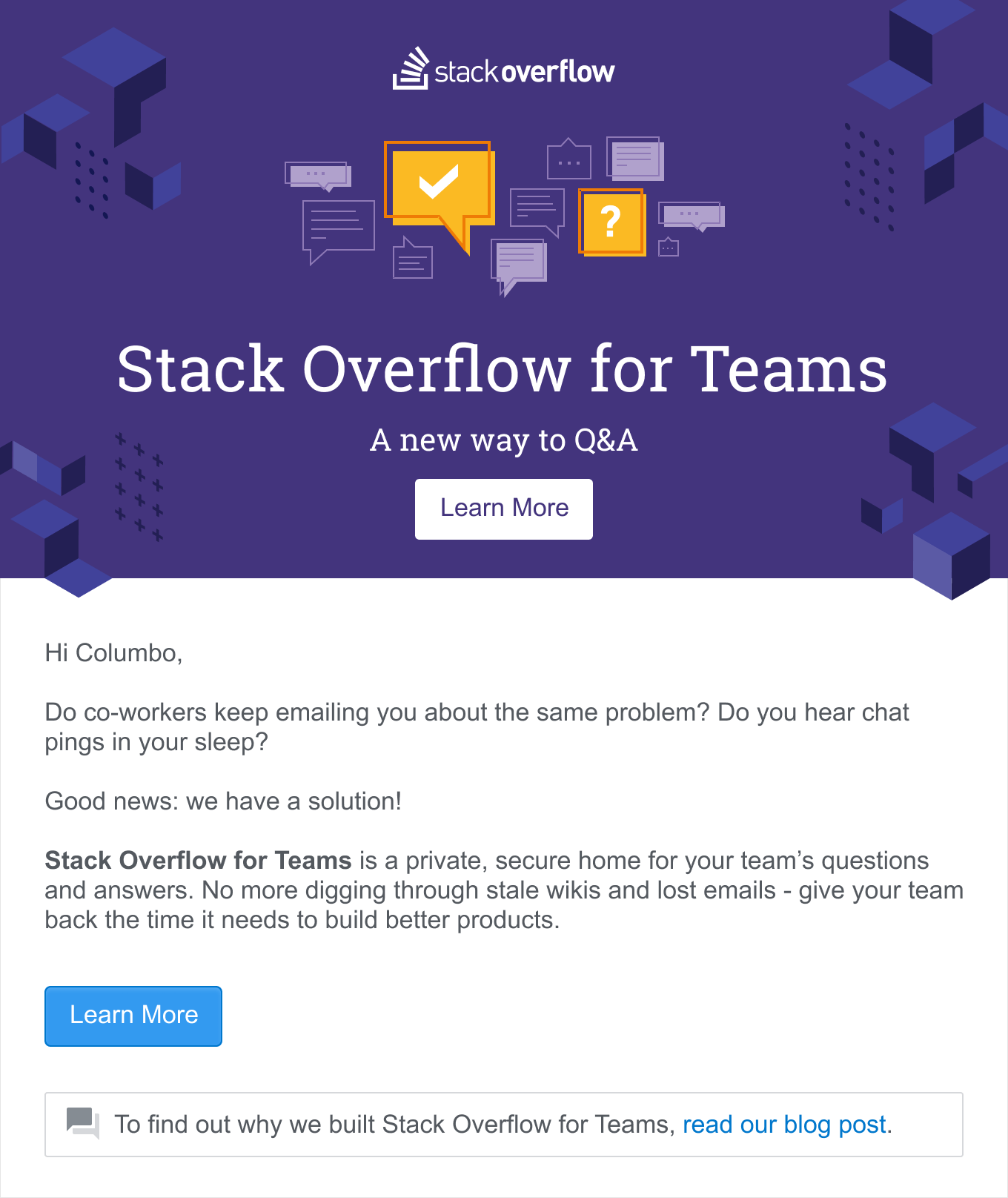
Enterprise
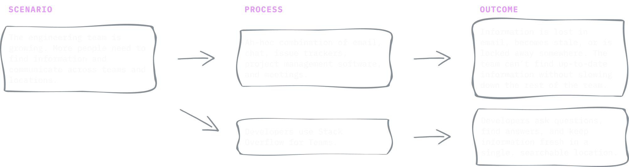
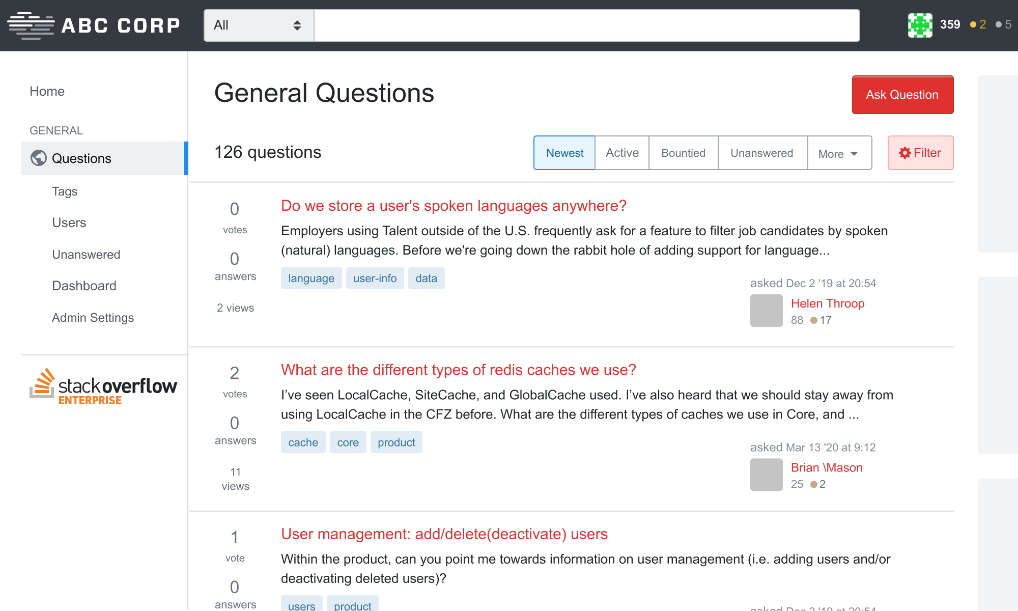
Stack Overflow for Enterprise is a private, secure version of Stack Overflow for large teams to ask and answer questions amongst themselves. It was Stack Overflow’s first private Q&A product and I joined as the product’s first designer when I joined the company.
It’s the same Stack Overflow developers know and love, built for teams to privately share information within their team.
As a product designer, I focused on:
- Building tools for clients to manage their comminuty, and
- Bending the public Q&A product in ways that make sense for teams but not the geneal public.
Theming
Security and privacy were top concerns of Enterprise customers. Many times folks had their private Enterprise site open in one tab and public Stack Overflow open in another, so it was important they know which is which at a glance so they don’t post info in the wrong place. One way we tackle this was to make a Stack Overflow themeable.
I created Stack Overflow’s first theming system and scaled for our enterprise clients. I refactored existing LESS variables so new themes could be created in eight(8) lines of code. Later I designed a UI allowing folks to update their theme without touching code. Balpha and Aaron Shekey have since evolved this system to include the entire Stack Exchange network.
@import "less/_enterprise-base.less";
⠀
//  ======================================
//  User-defined variables
//  ======================================
@logo-width:            150px;
@logo-height:           30px;
@topbar-background:     @black-025;
@topbar-nav-color:      @black-900;
@link-color:            #2b00f7;
@accent-color:          #007733;
⠀
//  Overrides and customizations
@font-family:           -apple-system, BlinkMacSystemFont, Avenir, ’Segoe UI’, Roboto, Helvetica, Arial, sans-serif;
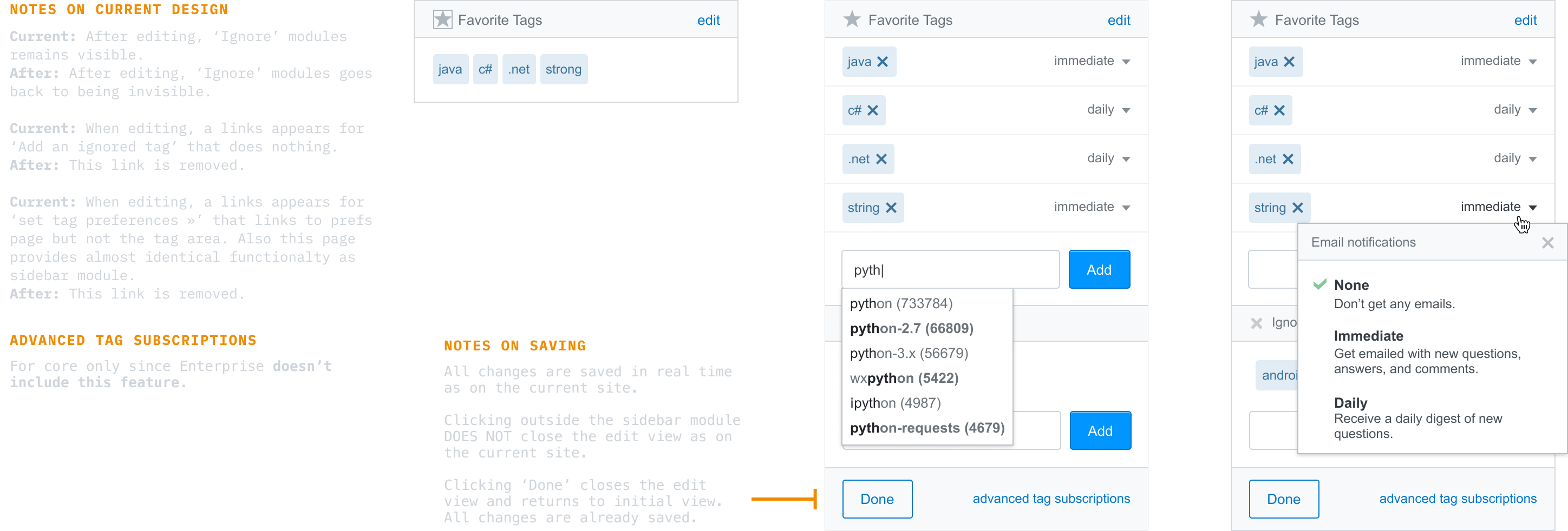
Tag Watching
Private Q&A products are smaller than public Stack Overflow, so it’s important that questions are seen by the folks who can answer them. Watching tags is a great way to personalize what you see on Stack Overflow, but tags weren’t designed with private Q&A in mind.
I created and tested a few prototypes that made tag watching more flexible while not overwhelming folks with notifications. Paweł Ludwiczak and Aaron Shekey further evolved the design to what’s on in the product today.
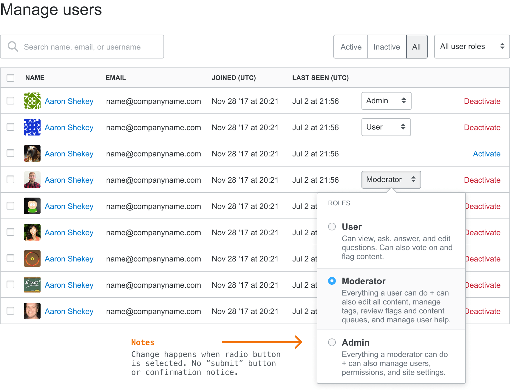
Admin Settings
In addition to adjusting the site for average folks, we created a suite of tools that enable admins to manage their own community. How the site looks, who has access to what, how notifications and awards work, that sorta thing.
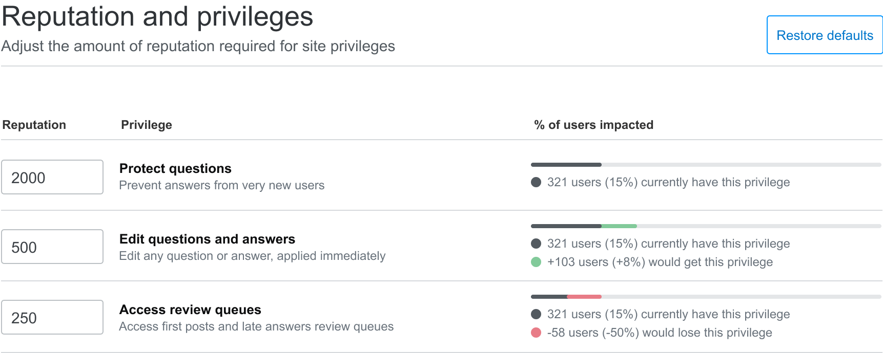
At one point when doing research interviews about an unrelated project, several clients mentioned that our settings weren’t organized well and some features were hard to find and understand. When hearing this became a theme, I pitched a redesign of our private Q&A settings and got it on an uncoming roadmap.
I worked with our customer success teams to identify the most used features, organized them using card sorting exercises, and created a flexible information structure that supports all of Stack Overflow’s Q&A products. After validating the new designs in user testing, we shipped the updated settings to our Enteprrise customers. A few months later, our Teams customers got the update as well.
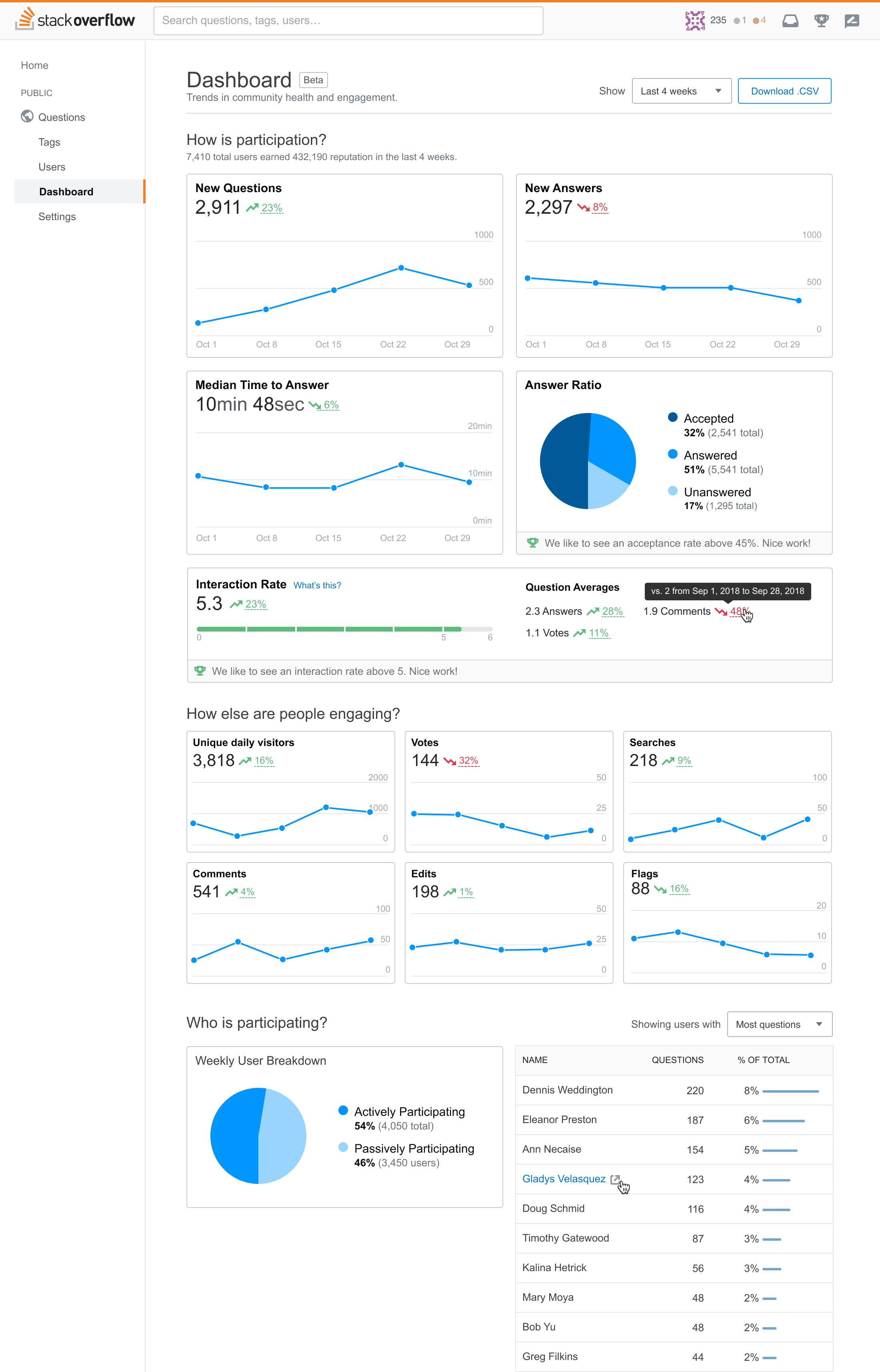
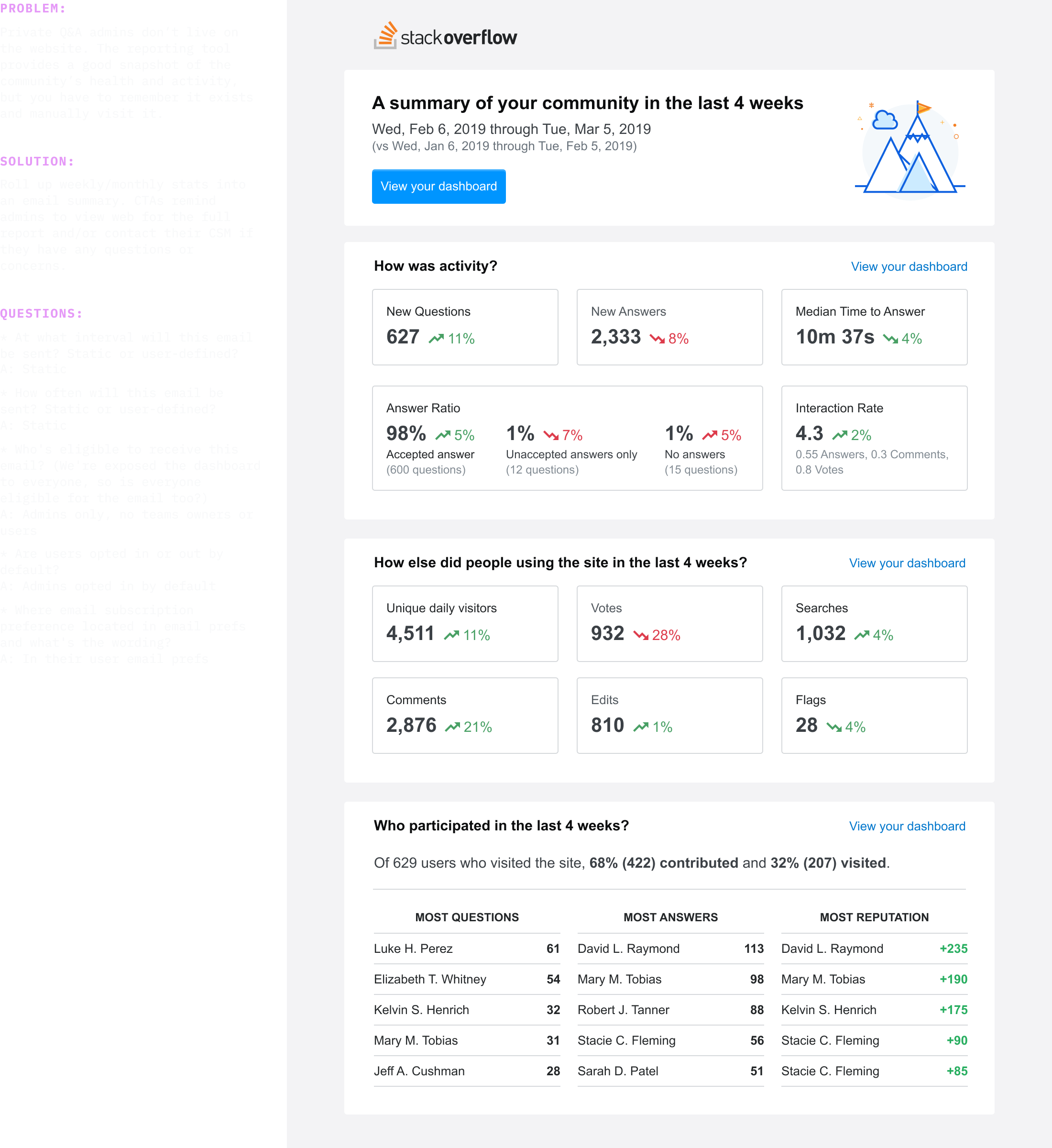
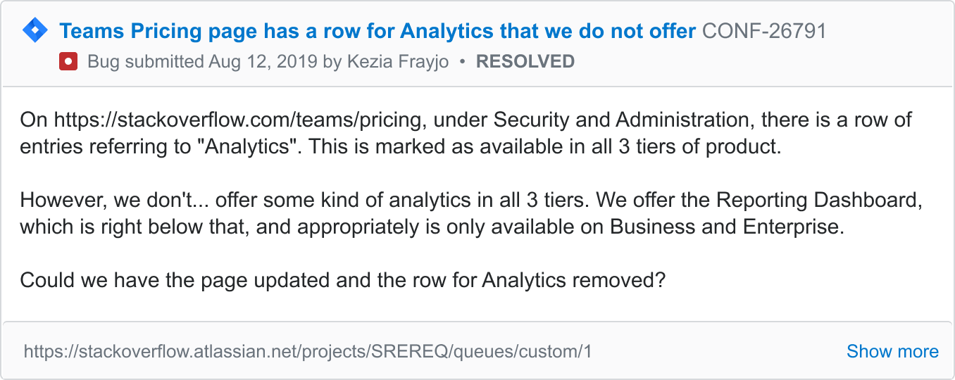
Health Dashboard
Enterprise clients manage their own community, but understanding its health wasn’t always easy. Our theory was if clients could easily see the return on their investment, they’d have a good chance to renewing and growing. Our product didn’t give them a way to do this, so the goal was to create one.
As an Enterprise admin, I want to know how I’m doing and measure ROI of Enterprise so that I’m aware of my community’s strengths and weaknesses. - Our user story
I started by speaking with our Customer Success team since their job is… customer… success 😂 In all seriousness, turns out they had a pretty good quantifiable formula to indicate whether a community was healthy or in danger of churning.
How could we productize this so it could scale beyond the Customer Success team?
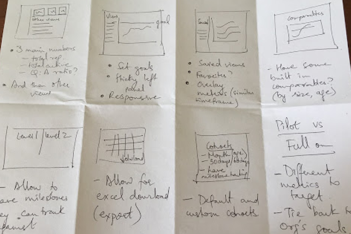
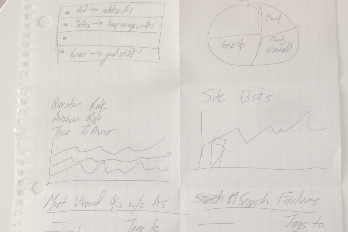
I figured this project would be complex, so I organized and led a series of How Might We? sketching sessions with our developers, product managers, site reliability engineers, and even our product GM. This open collaboration generated in a bunch of differnet ideas, most of which we would have missed if design was kept within the design team.
I created several wireframes based on these ideas and shopped them around to my product team, in design critique, and a few customers. At this stage I helped write a functional spec, and kept it updated with research findings, notable conversations, and updated designs. This doc served as a single, findable source of truth throughout the project.
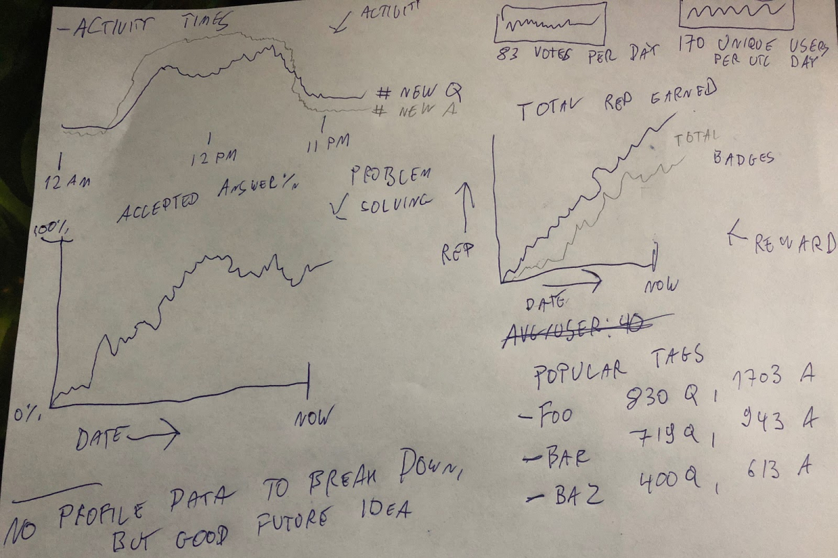
When our direction felt validated, I moved into UI design. I looked at our own product and as well as competitors to get an idea of how others visualize data like ours. Sidenote: Say what you will about “fake work” on dribbble, I find it incredibly useful.
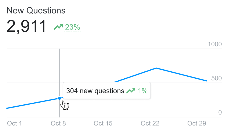
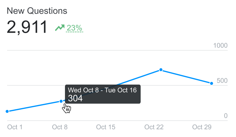
After creating a rough draft, I worked with our data scientist to review my data visualization choices. She raised a concern about zooming into the data too closely, so we decided not to break down data beyond a certain point (even though we technically could).
After I’d designed most of the feature’s views and states, I jumped into the codebase and translated my designs into front-end code. I made some last mile design decisions in code, like responsive views and adjusting the graphs’ appearance in D3.
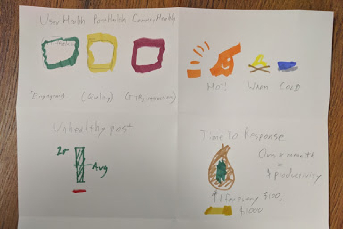
A few times the project started veering towards in an in-depth analytics product. Whenever I saw this happening, I gently reminded the team of our north star to focus on trends and not get too detailed with the data.
We saw an immediate drop in the time our customer success team spent reviewing metrics with clients because clients were now able to do this on their own. Shortly after launching for our Enterprise tier, the feature was scaled to all other tier of Stack’s private Q&A product.
Most feedback from our Enterprise customers came from client interviews, so I’d periodically check in with our customer success team to see how folks were reacting. The overall feedback good positive, but we heard that clients don’t always remember to visit their dashboard. they also wanted to share it with folks at their company. We needed to make the data more accessible and portable.
After hearing this a few times, I created and shipped an email digest to help solve these problems. We also looked at notifications and integrations (like Slack and MS Teams).
Teams
In 2017, the Stack Overflow began creating a new product called Teams to fill a gap between the public Q&A product and Enterprise. The goal was to make a scaled-down version of the Enterprise product for smaller teams. Stack Overflow assembled a tiger team of folks including Jin, Joshua, Paweł, Chance, Kit, myself, and several others to explore the product UX. I focused on the product’s first run experience: what happens after you’ve completed the signup flow and and land in the product for the very first time. In the interest of speed, I worked at a low fidelity and guided implementation as engineers used the design system to fill in the details in code.
Integrations
We don’t expect our customers to spend all day on Stack Overflow, so make our product more sticky, we met them where they already are. Slack, Jira, MS Teams, and the like. One way we did that was with integrations, which are table stakes these days. I worked across product teams to research, design, and test various designs and workflows to support several integrations for all our product lines.
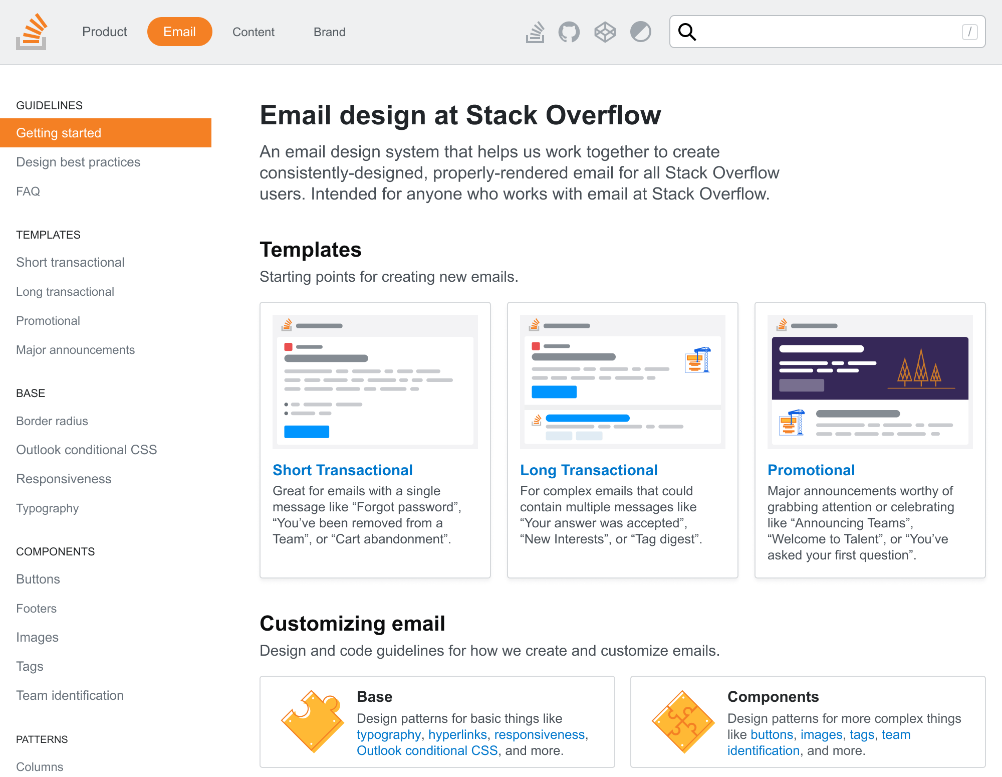
Design system
During my time at Stack, I was an "enthusastic volunteer" on our design systems team. I built and documented components for tables, cards, empty states, link previews, page titles, and more. Donna Choi and I also created a section for UX copy.
My biggest contribution was Stack Overflow’s email design system (one of the first of its kind). I designed, coded, and wrote everything about how I built email at Stack Overflow. Tons of knowledge that was previously only in my head was now documented.
The email design system empowers non-email-designers to build well-designed, consistently-rendered email without knowing all the ins-and-outs of email design. It removed me as a bottleneck. I’ve written several articles and given a few conference talks about this topic.
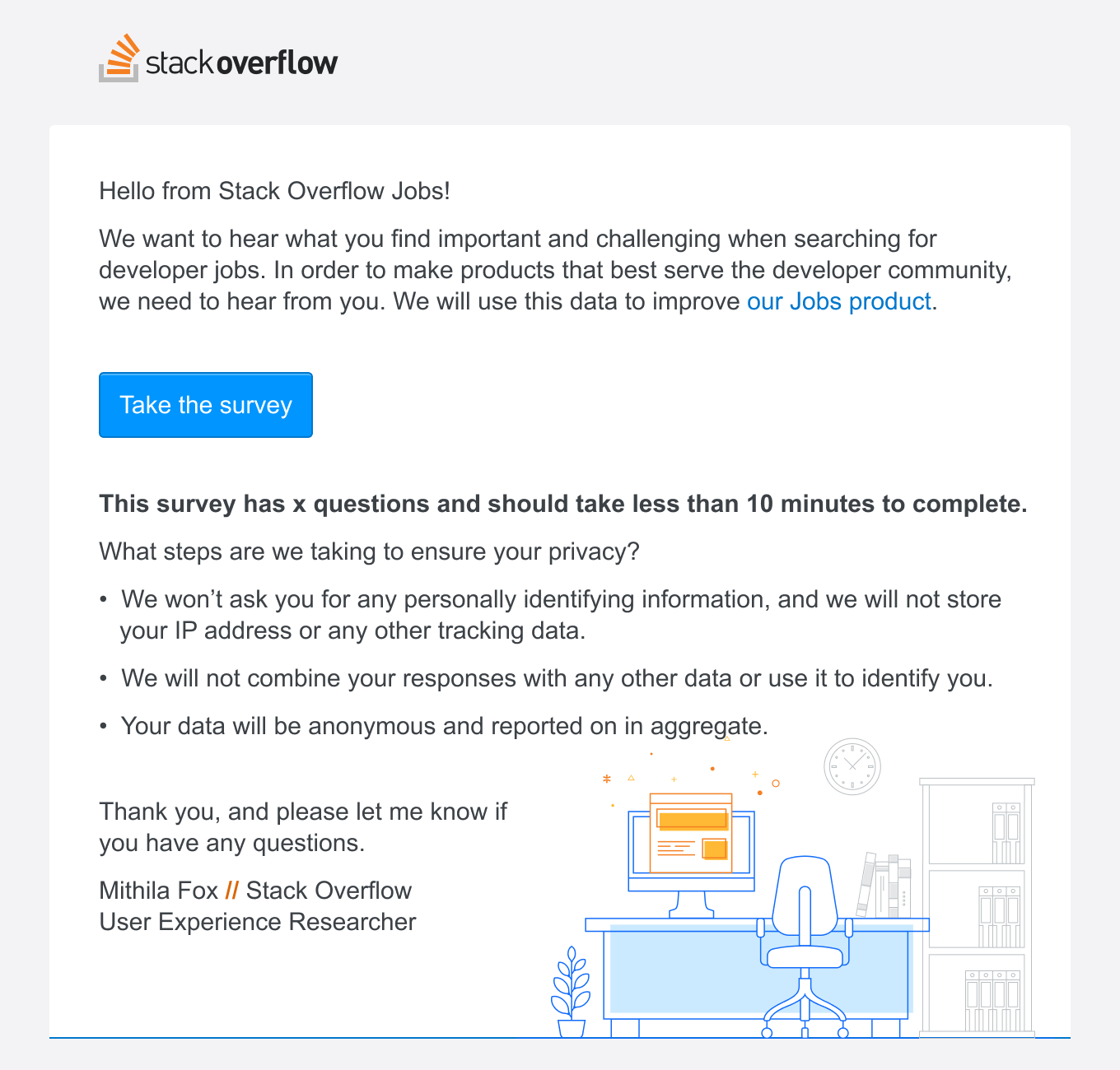
Email Marketing and UX
When I joined Stack Overflow, the company didn’t send much email aside from a few transactional emails. Email templates were inconsistent and often broken in many places. I standardized our email design, fixed rendering issues, and set the company up to take some bigger swings with its email announcements. A lot of this work fed back into the aforementioned email design system.
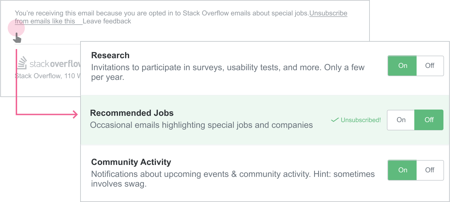
Email Preference Center
As Stack Overflow’s email program evolved and started to send better-targeted emails, Donna Choi and I redesigned our email preference center to keep pace and bring us in line with GDPR compliance, which had just started being enforced. We wrote a case study about this project.
Experiments
Between projects, I explored several product and feature ideas. Some got prioritized on the roadmap while others never saw the light of day. Here are the ones I’m proud of:
Voting from your email inbox
When speaking with Teams users, many mentioned wanting to improve their community’s culture of voting. Their team posts useful answers, but folks didn’t acknowledge them to signal a high quality answer for others.
If folks don’t return to the site to vote, what if we reduced that friction by meeting them in their inbox? This prototype explores what it would be like if you could vote on Stack Overflow questions right from your inbox.
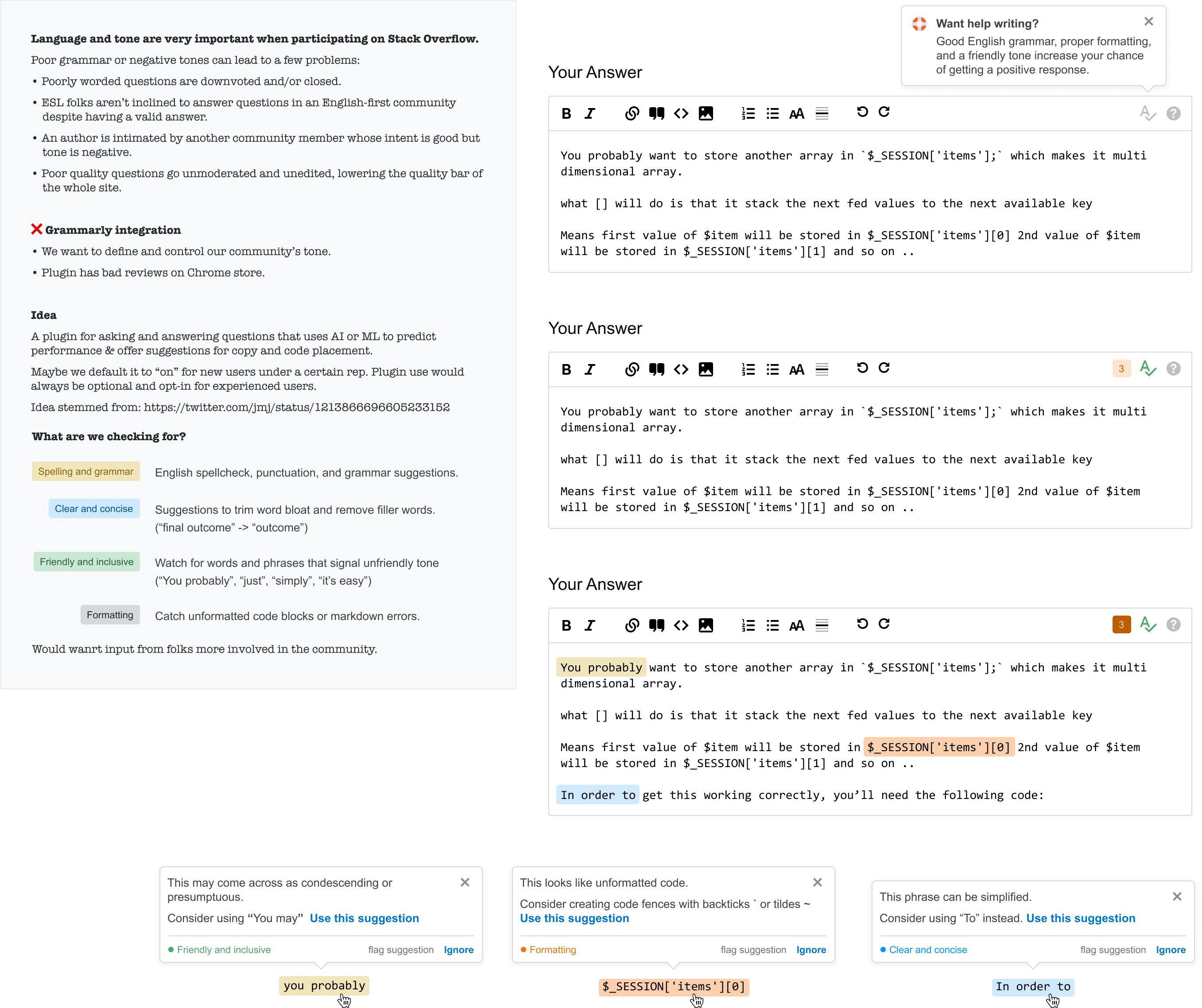
Grammarly on Stack Overflow
Language and tone are very important when participating on Stack Overflow. Data showed that well-crafted and properly-formatted questions are likely to get a positive response.
This design exploration productized some of our internal knowledge and experience of what makes for a good question.
Dark mode in email
Developers love dark mode. The community mentioned it often and our survey data backed that up. With a co-worker leading efforts to bring dark mode to the website, I explored what it would take to bring dark mode to email.