Go Digital 2016 in Reykjavik, Iceland
I attended Go Digital 2016 in Reykjavik, Iceland. I attended the sessions and workshops related to design, user experience, and front-end. As a product designer, I came home with a number of ideas to talk about with multiple teams at Stack Overflow. I also learned a great deal about Icelandic customs and the country. Spoiler: it’s beautiful!!
The following are a few partial recaps of the workshops and sessions I went to.
Interface Design Workshop with Aarron Walter
I attended Aarron’s Interface Design workshop on the first day. It focused on “building the right thing” rather than “build the thing right”. Because building an actual working MVP is hard, and if it fails it can be really expensive. We ran a modified version of GV’s Sprint in one day.
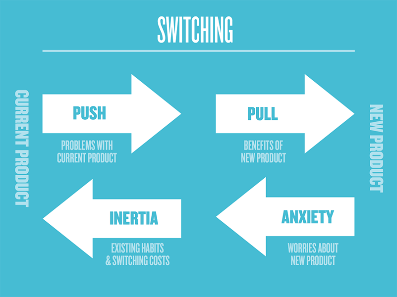
Aaron introduced Interviews as good for new ideas with no prototype to test or analytics to reference. Interviews help to discover what drives people to a new product (problem with an existing product, perceived benefit to new one) and what feelings they fight against when doing so (anxiety, existing behaviors, risk of switching). While they can be done remotely over the phone or a video conference, Aarron mentioned how MailChimp sometimes sent two or three employees to meet with clients in-person. When I asked when this kind of investment is appropriate, he responded they typically did it for larger clients and conducted multiple interviews in a single trip. In addition to more face time, in person meetings can sometimes have unplanned events. Like the time an accountant dipped her head into a meeting and the team ended up learning how their client evaluates purchasing decisions. Pretty neat!
Another thing Aaron touched on was Ideating. There is a saying in design school: “100 thumbnails”, meaning create 100 tiny thumbnails of what something could look like. The idea is to get every possible idea out of your head so you can fairly evaluate them. In modern UI design, 100 thumbnails is pretty crazy, about eight should do. Aaron challenged us to create eight thumbnails in five minutes (I could only muster four!). As designers, sometimes we have a mental model in our head when starting a new design, and instead of creating a number of varying designs, we pick one idea and refine it. Trouble is, the first design may not be the right design. This exercise fights that bias and forces us to explore ideas that might not seem like the right idea at first.
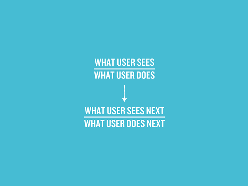
Flow Notation is an interesting concept. It’s like extremely-granular, text-only user flows. It’s important not jump into sketching UI too soon. but rather pause, break it down, make sure we’re designing the right thing.
Think about the problem 90% of the time and work on the solution 10% of the time.
One of the final things Aarron discussed was Delight, or designing an enjoyable experience. This term is thrown around our industry a bit. Folks put it at the top of the product design pyramid: after everything else is done we’ll sprinkle on ~some delight~ to seal the deal. Problem is this means delight is an afterthought that gets treated as a nice-to-have on an already finished product. Worse, it seems forced into an experience where it doesn’t fit.
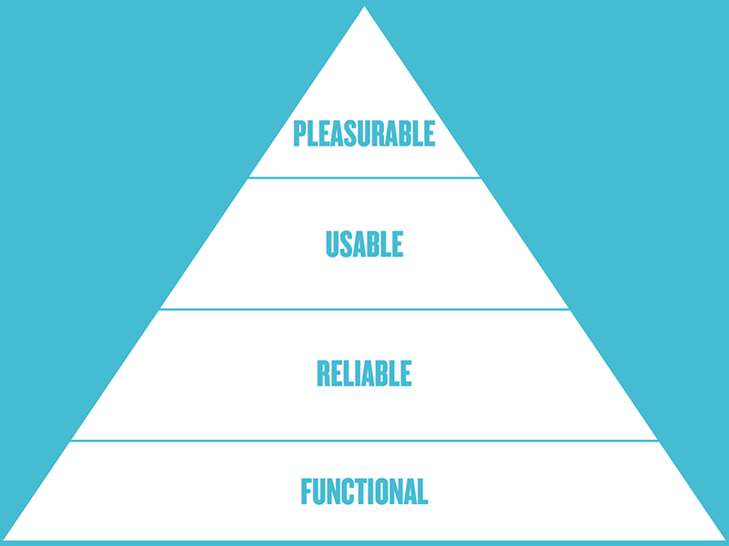
Aaron’s solution: build some delight in from day 1.
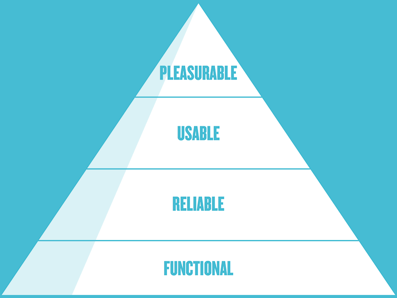
Instead of building UP the product pyramid, build slowly from the side (it’s all four things but only one feature, then it’s all four things and two features, and so on). This was eye opening for me, it’s quite different from the way I work.
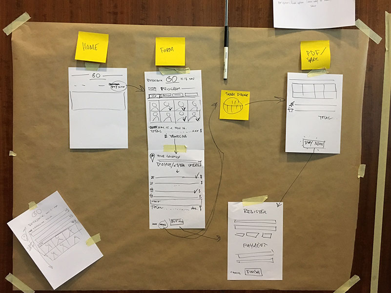
Throughout the workshop, the audience broke into teams and worked through each step. At the end of the workshop, each group had job story, an annotated storyboard, and a lot of questions. Here’s the one from my group:
Conference
Beyond the UX Tipping Point by Jared Spool
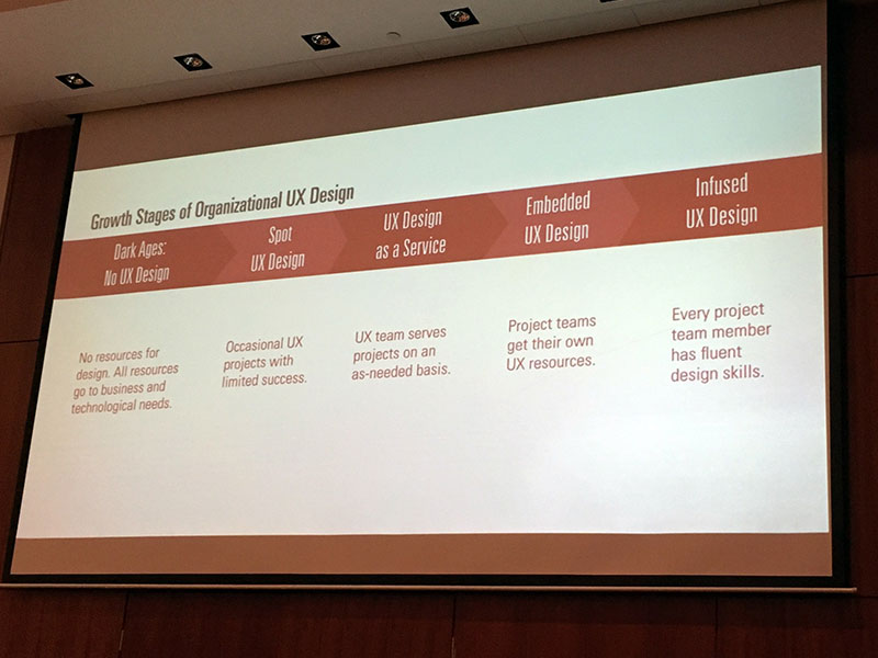
Jared’s keynote was about UX design at an organizational level. He argued that design happens no matter what, even if folks don’t realize it. Having a dedicated design team is good. Having designers embedded into teams is even better. But a lot of people can end up influencing the design, not just designers. The CEO, a project manager, a lawyer. When it comes to design, an organization is only as good as its weakest link. For an organization to cross its tipping point, everyone in the organization must have basic design training. This can be a BIG shift in culture, but it can pay big dividends. Nothing immersive, say two hours every six weeks.
Another thing Jared talked about not shipping a product until it’s well-designed. If something works technically, meets business goals, but isn’t thoughtfully designed, don’t ship it and fix it later. “Later” will never happen. If design is not prioritized, it’s like eating edible food. Yea, it gets the job done, but won’t attract too many people.
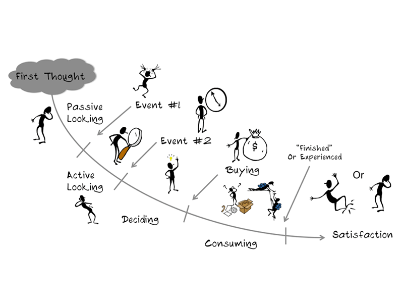
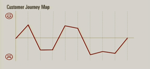
One last thing I found interesting was how Jared graphed out a user journey. Seems like great way to visualize what step(s) of an experience users struggle with. I’m thinking of applying this to our usability test reports.
Jared’s whole talk is available online.
Principles of Product Design by Aarron Walter
There was some overlap between Aarron’s workshop and his talk, so I’ll cover some new stuff here.
Aarron explained how surveys can get useful information at any point in the user journey, but he suggested two points where they can pay huge dividends: 1. when someone first signs up or buys, and 2. when a someone cancels or becomes dormant. Often there is a lot of emotion tied to these actions, and getting the customer while these feelings are still fresh can reveal a lot about their intent.
Many of the techniques Aarron talked about produce data. Survey results, transcribed interviews, usability test recordings, analytics reports, and more. So where should all this data go? He recommends a single, self-serve repository that anyone can access.
Spreading a System Across People and Products by Nathan Curtis
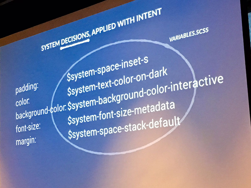
Nathan spoke about designs systems. With more than a few under his belt, he suggests starting by defining typography, color, iconography, and spacing, and getting those into variables with modifiers. Nail that first.
When it comes to site implementation, Nathan recommends starting with the most popular, app-like views (rather than marketing pages or gasp the home page). Starting with the most used, complicated views and branching out makes the other areas easier to tackle.
My biggest takeaway was his recommendation that a team be dedicated to creating and maintaining a design system. Treat the system itself as a product. He believes that a design system cannot succeed as a “side project”. If it only has one or two people supporting it, no one is going to trust it. Plus it creates problems if it needs to be modified and no one is available. Product teams often have bug-duty (where you stop building for a few days and just fix bugs), why not design-system-duty?
The Build Trap by Melissa Perri
I was chatting with someone between sessions and missed some of this presentation. Here are a few nuggets:
- Product leaders provide a project’s vision, goals, and guard rails. The team should be allowed to explore. (Amen!)
- Customer problems are your lack of features. As builders, we’re biased. Researching early and talking to customers helps resolve uncertainty and leads to building valuable products.
- In one test less than 2% of people clicked on a hamburger menu used to house a site’s main navigation. The business almost tanked as a result.
The Future of the Web by Pete Smart
A great way to end the day’s lectures. Words cannot sum up this high-energy talk, you’ve got to see it for yourself. Here is a recent version:
Iceland
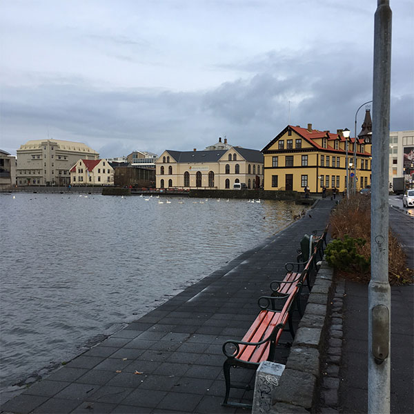
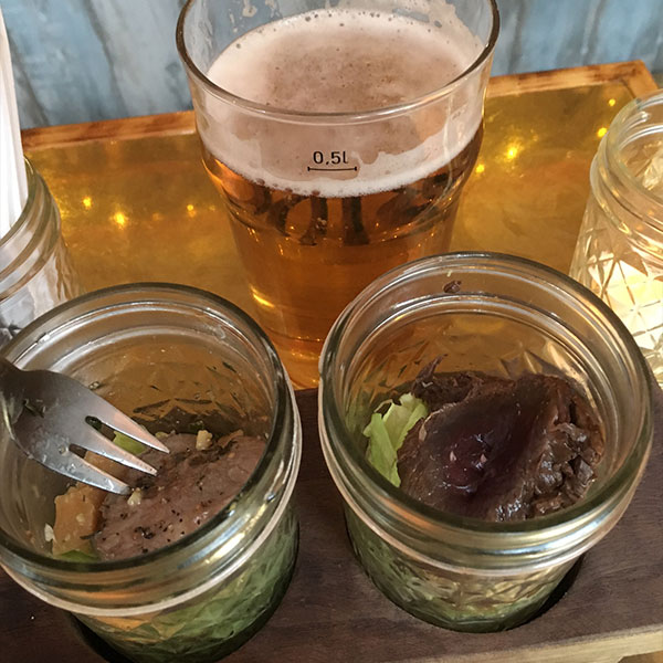
I learned a lot about Iceland outside of the conference. I hadn’t previously visited a nordic country. The scenery and architecture are breathtaking, even on a rainy day. Here are some pictures:


Here are some tidbits I learned from various conversations:
- Cellular providers are quite expensive in Iceland, so folks use apps optimized for Wifi rather than a cellular connection (Eg. using Facebook Messenger instead of Messages).
- Many technology business in Iceland are not remote friendly… yet. Since Iceland has just ≈300,000 residents (≈200,000 in Reykjavik area), this is starting to change.
- Many natives are fluent in Icelandic, English, Danish and one other language of their choosing. Icelandic seems like the language of choice, but folks can switch languages on a dime (eg. when an English-only speaker walks into the room).
- Iceland is more laid back than the northeastern US (yea big surprise).
Wrapping Up
I left the conference fired up. Not fired up to come back and completely change the way Stack Overflow designs; I think we’re already pretty good at that! I came back fired up to do some of the less glamorous parts of product design: working on interview scripts, creating functional specs, transcribing usability tests, and combing through the class names in our design system. I still love the design and code parts, but realize if I improve in other areas, I’ll be a more complete designer.
Thanks to Kolibri, the speakers, and attendees for making Go Digital such an amazing experience!
Keep in touch 🇮🇸 – Ted @tedgoas
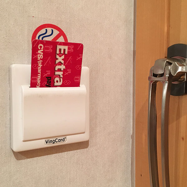
Fun Fact: For hotels that require a room key to keep the electricity on in the room, any card will work in the slot. Useful for when you only have one room key and want to charge a laptop while you go out to dinner.
Also published on Medium