Design Systems for Email: Bringing Order to the Chaos
How we started, what we built, and what we learned building our first email design system at Stack Overflow.
Email design systems are a way to improve the consistency of email designs and help teams scale their email production. At Stack Overflow, we’ve been building an email design system to support the company’s email production. Before I get into that, I’d like to give a little background about myself.
I started my career in 2001 as a web designer. In 2001, operating systems were sold in boxes and my toolset was much different.Back then, I sent out the occasional text-only newsletter, but my work focused on websites. But I usually worked on small teams where folks wear multiple hats, and wouldn’t you know it, email was always been something that needed to be done. At some point, I volunteered to do an email… and over time I did so many that I got pretty dang good at it. Since 2007, email design has been a part of every job I’ve had.
But I usually worked in low volume environments. Mailing lists were relatively small and email creative could be managed by two or three people. Email marketing was relatively straight forward.
That all changed in 2016 when I joined Stack Overflow, the world’s largest question and answer site for software developers. On an average week, Stack Overflow sends ~4 million emails across 70 categories, and that’s when we’re not promoting something. A much larger scale than I was used to. At Stack Overflow, email production is decentralized. All product and marketing teams all work on email and are empowered to do whatever they want. But they always don’t talk to each other. 😕
This created an email environment where emails were:
- Inconsistently designed and off-brand because there was no shared record of email design.
- Expensive to make because we’d spend a lot of time recreating the same emails.
- Often broken because no one specialized in email and folks weren’t sure they were doing it “right.”
We realized we’d have to change the way we build emails and one way we’re doing that is with an email design system.
Design system… wat?
Wait, hold up! What exactly is a design system? I mentioned it’s a way to improve emails at scale, but how?
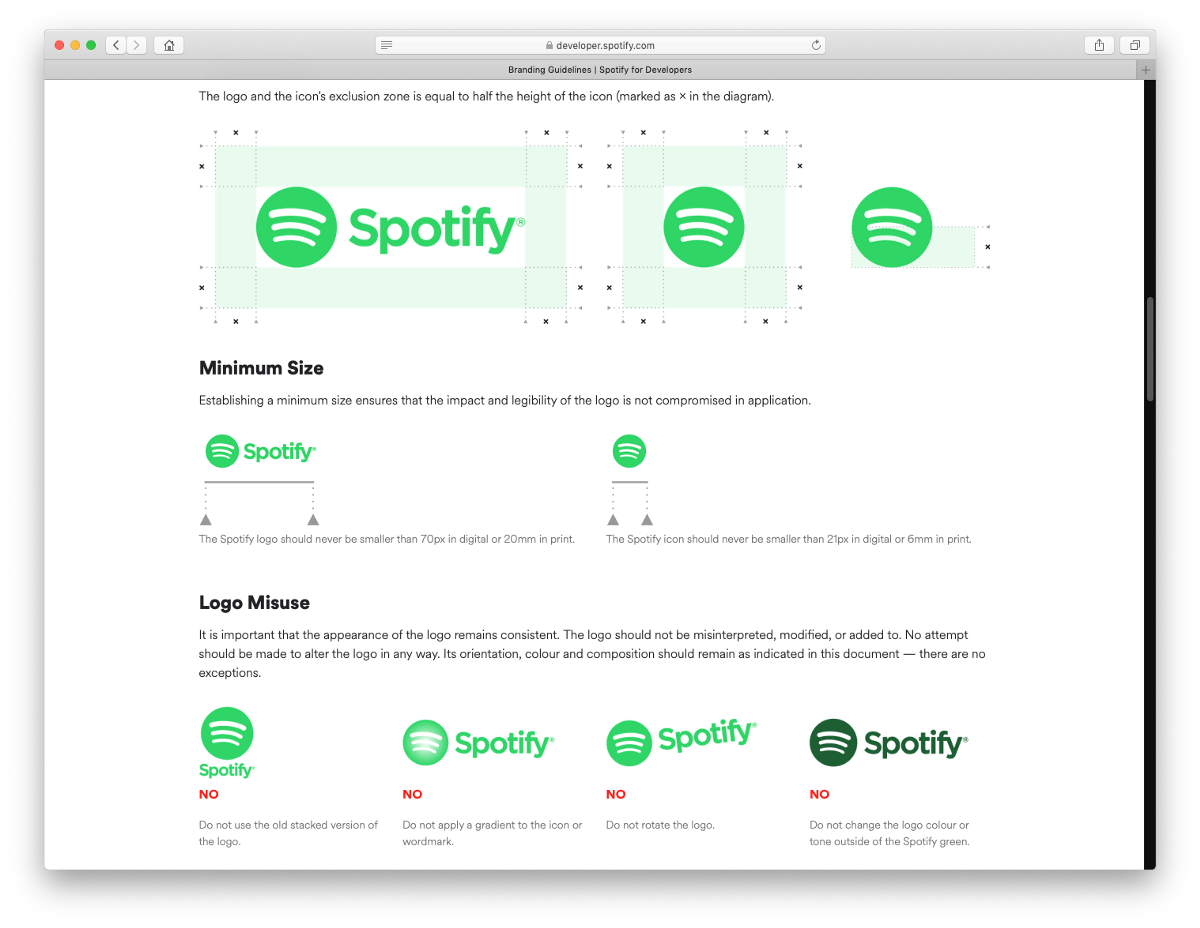
Is it a like brand guide…? These sites that show you how to use a brand’s logo and colors…? Not exactly. Brand guides include design guidance, but lack code examples.
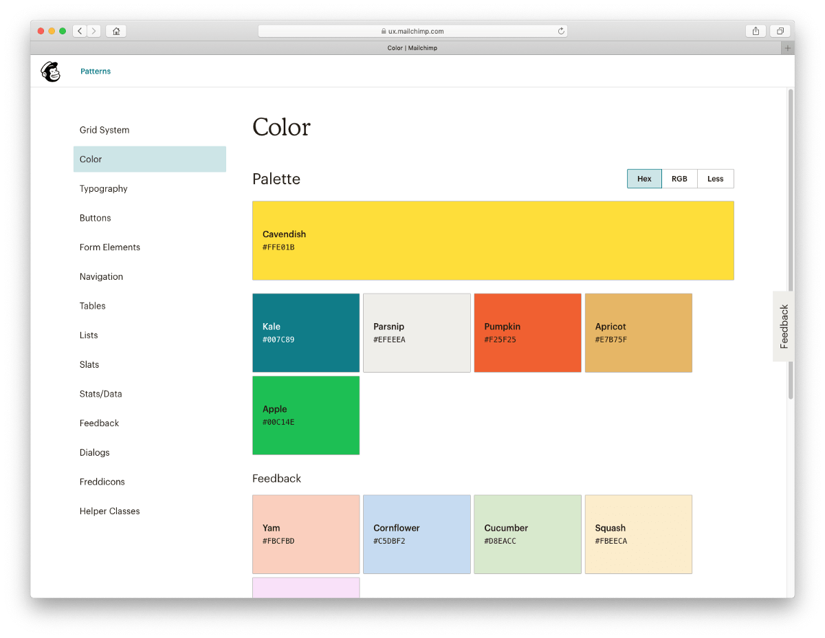
Ok… then is it kinda like a pattern library…? Not quite. Pattern libraries include design components and code examples, but lack documentation on how and when to use them.
A design system combines these two.
A design system is a collection of reusable components, guided by clear standards, that can be assembled together to build any number of applications. — Marco Suarez, Design consultant, Previously at InVision, Etsy, and Mailchimp
The definition of a design system varies, but I’m going with this one. Think of it as a lightweight scaffolding and guidelines to design with, rather than creating stuff from scratch or plain sight. Design systems are often compared to LEGO Sets: a collection of standardized components that can be mixed and matched to build designs. Having a design systems means we don’t have to design our own legos.
It reduces the need for bespoke design, which is slow, inconsistent, hard to test, and difficult to maintain as teams grow and work volume increases. Simply put, bespoke design doesn’t scale.
The best design systems cover not only the what, but also how, when, and why of design. Design systems for the web have become popular as companies realized the need to strengthen the design of their products to compete. Design systems for the web have become popular as companies realized the need to strengthen the design of their products to compete. An email design system takes these same principles and applies them to email design and production.
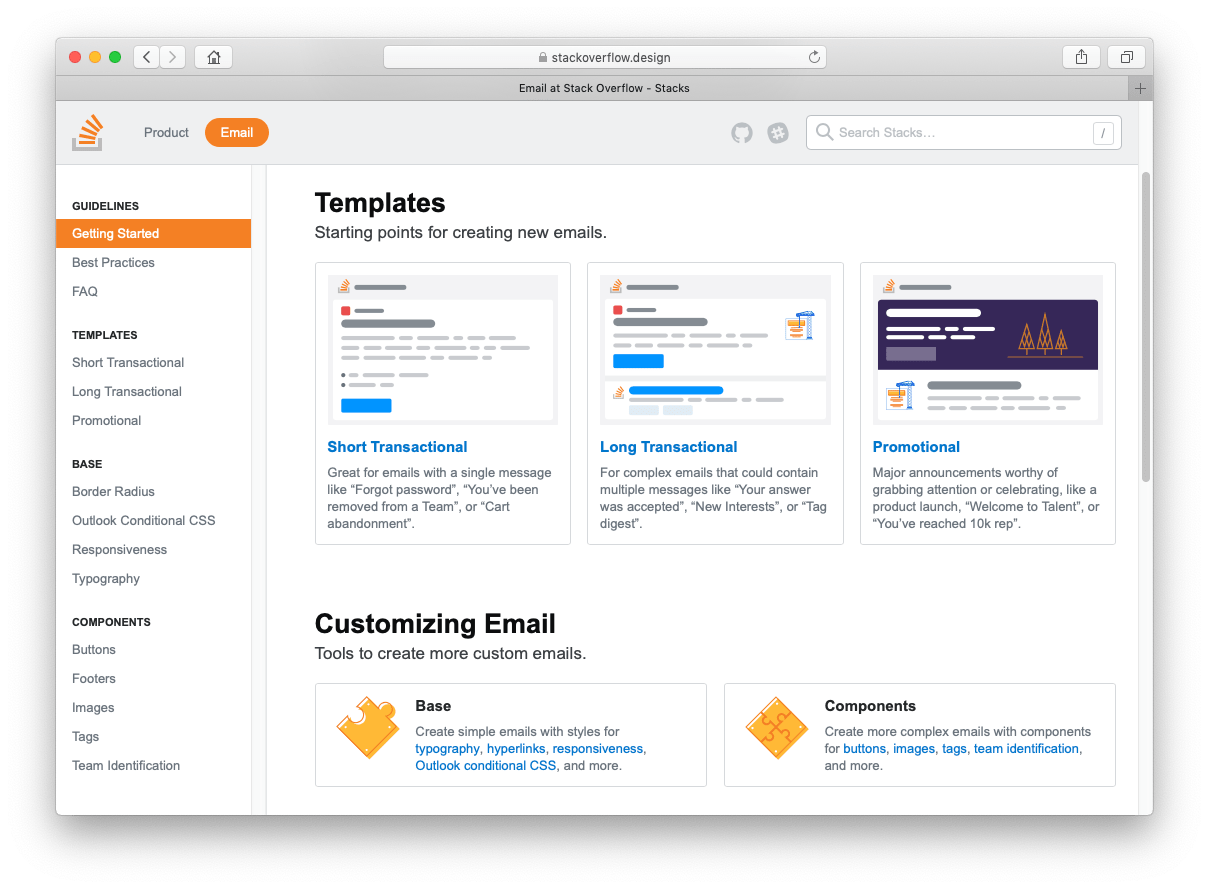
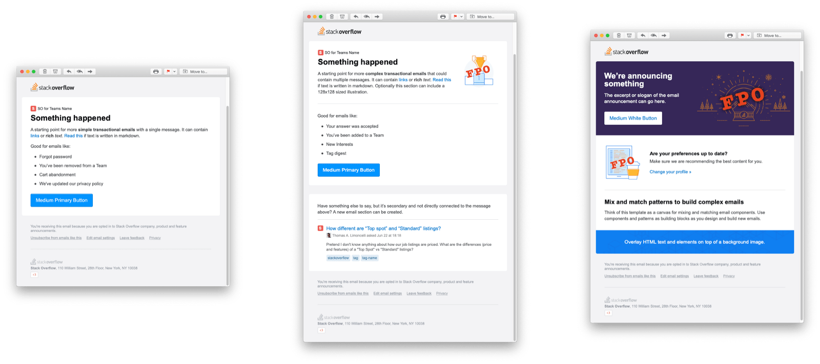
Here is what Stack Overflow’s design system looks like. Our email design systems lives alongside the “website” design system, brand guide, and voice and tone guidelines.
The email section contains a few starter email templates, common email components like buttons and text styles, and guidelines for how to use it all. Everything is on-brand and tested in 70+ email clients. What this does it enables more people to create consistently-designed, properly-rendered email without being an email design expert.

So email design systems are great! They’ll the fix all our email problems and we should all be using them to create all their emails, problem solved, right? Well… not necessarily. And that leads me to the first of five lessons I’ve learned while working on Stack Overflow’s email design system:
Lesson 1: First, feel the pain
First, feel the pain of not having one. I’ll explain what I mean by “pain.”
When I joined Stack Overflow, there wasn’t a process for email design and development. It was common to see folks building emails the same way they built web pages. They knew mobile email is hard and nothing really works in Outlook, but they weren’t familiar with the common gotchas that seasoned email designers “just know.” This resulted in a bunch of inconsistently designed emails that fell apart in many email clients.
For a company that sends four million emails a week, that’s a problem. At best, a broken email contributes to the broken windows theory (“if this email’s broken, I wonder what else at Stack Overflow is…”) and erodes someone’s trust in us. At worst, it means someone can’t complete a task, like if a button doesn’t click.
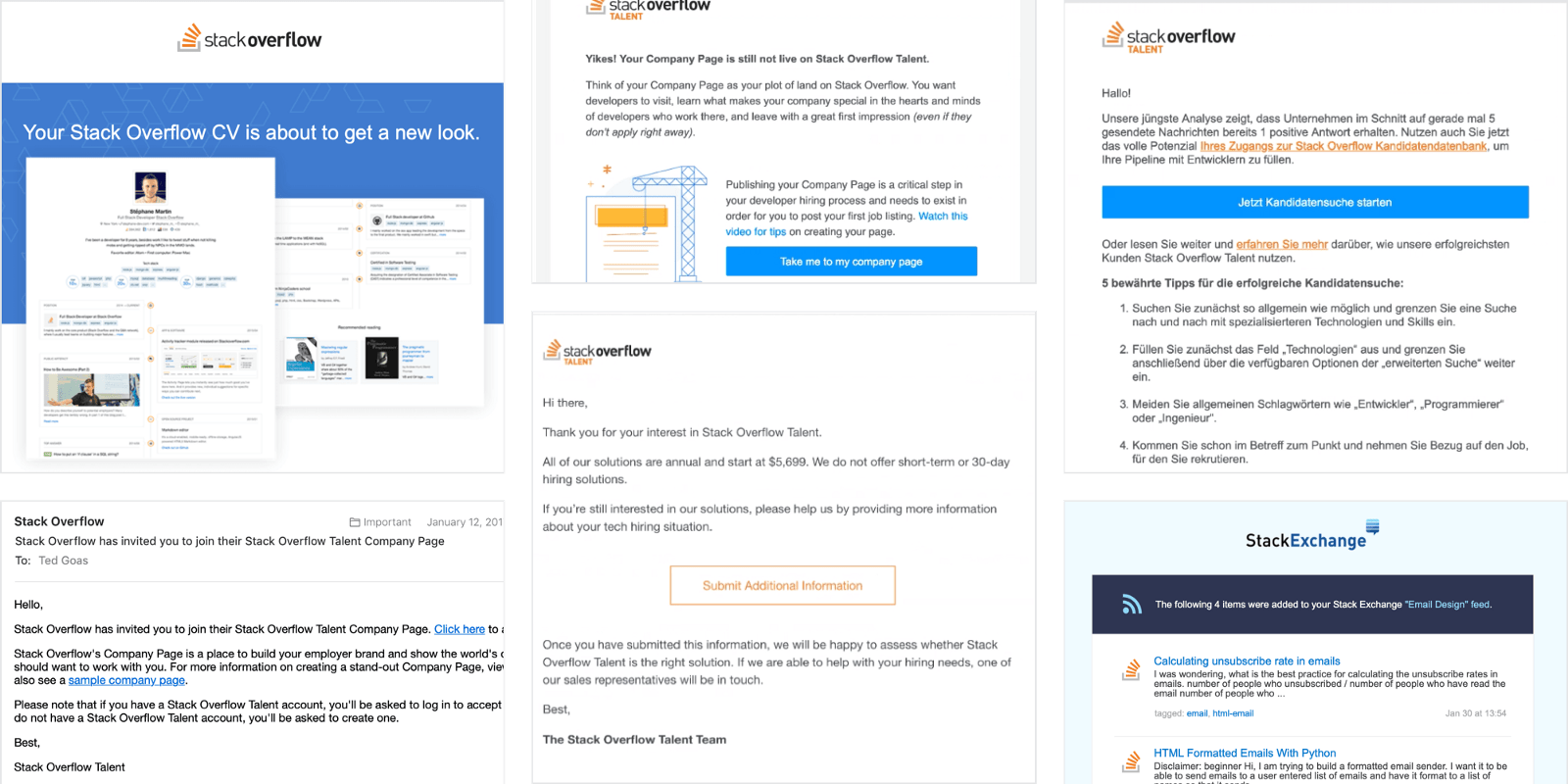
When we put more effort into an email project, the process was slow and code was hard to test. This is quick sampling of some old emails. At a quick glance, I see links in multiple colors, more than a few button styles, the logo is centered… sometimes, and occasionally some teams didn’t even bother with HTML and went with text-only emails. Kinda all over the place.
As I mentioned, email is a decentralized discipline at Stack Overflow, so there’s no single team in place to reign all this in. Only one or two people had experience with email design, and they often created a bottleneck when asked to help with email projects.
We felt the pain of not having a way for folks to build proper emails at scale on their own and identified an email design system as a solution to our problem. If you don’t feel a similar pain, maybe you don’t need to invest in a design system. The Design System Decision Tree is a good read here. But if you do feel the pain…
Lesson 2: Make it official as early as possible
Ok so you’ve thought about making your own email design system, started pitching it around, and have a grassroots interest… Now what? Where do you start?
How about using whatever spare time there is between projects? Sounds logical. It’s how we started. However, our initial efforts were scattered and progress was inconsistent. Whenever we started gaining momentum, we’d get pulled away onto project work. We didn’t have regular check-ins or a roadmap. And no one was being held accountable because we were treating this as a side project.
“If a design system is treated as a side project, it’ll probably fail.” — Nathan Curtis
After a while, we learned that our design system would need to be an official project or the company would just keep pushing to ship product work faster instead of building a better future.
So, we felt the pain, right? We knew we needed a better way to build email and thought an email design system would do that, but how do we convince the boss? Here’s how we made our case:
- Time: We spend a lot of time solving the same problems over and over again. An email design system will speed us up by codifying common components, empower more people to build email, and free us all up to work on other things.
- Money: Our emails typically don’t bring in revenue directly, but they drive platform adoption, which does tie to revenue. An email design system also eliminates the need to outsource email work or hire an email specialist. And there’s always the “Take everyone’s time spent on an email, multiply by their salary, and add it up to show management how much an email cost to make” argument.
- Consistency: Our emails are inconsistent and often broken. A design system codifies common patterns, giving designers some creative freedom, but keeps them from “just going for it” on typical email projects and creating something off-brand.
- Education: Most importantly, an email design system’s documentation becomes a shared record of the team’s email knowledge and best practices. It removes information silo’s and bottlenecks caused by only a few people being experienced with email.
“If you allow a small group of employees to build a design system, all these problems go away. It will cost you about X hours a week for Y months.”
Our pitch went something like that. Yours may vary.
It helps to think about what your boss (or your boss’s boss) cares about. They might not care if a button looks funky in Outlook, but they might care about the extra five hours the team spent QA’ing that email last week or lost sales caused by a link that wasn’t clickable.
It took a long time (like, almost a year!), but ultimately Stack Overflow recognized our design system as a sanctioned project. Now we have regular check-ins, a roadmap, and just recently our first full-time person dedicated to the design system. But it was a slow burn for us, so it helps to start pushing for this early.
Lesson 3: Start small, involve others early
When it comes time to plan a design system, it’s tempting to look at other design systems to see what they’ve done. We found a bunch of design systems with elaborate marketing sites containing detailed documentation for every conceivable component bundled up in an npm package with a build process.
While it’s good to do a little competitive research at the beginning, it can be paralyzing to consider all that on day one. We reminded ourselves that these other design systems were the product of months of hard work.
We started small. Like, really small. Like, in a blank Google Doc with editing rights enabled for everyone.

We invited folks from all over the company to discuss what email components they use most and what questions they have. Engineering, product managers, marketing… we even got legal involved.
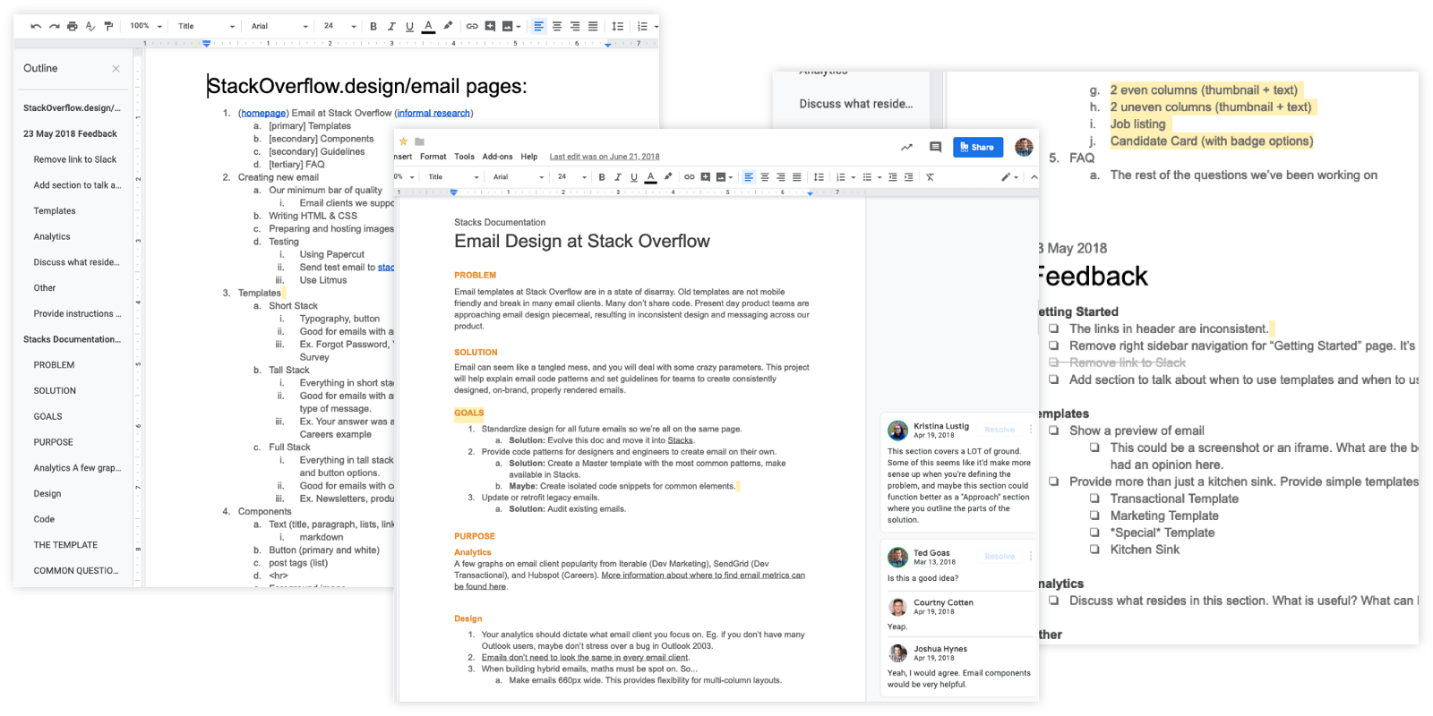
Using a Google Doc lowered the barrier to entry and allowed everyone to brainstorm with us without configuring any software or being familiar with code. Hearing everyone’s voice at the beginning showed how everyone thinks about email differently and informed where to focus our initial efforts.
Whatever shape it takes, it’s helpful to welcome people into your work early. It prevents work from becoming silo’d, invites different perspectives, and ultimately produces a better product.
It also helps with adoption. A design system is not something to impose on people. If the design system will one day govern emails across an organization, more folks will adhere to it if they feel like part of the process. Open collaboration helps a design system take root.
Lesson 4: It doesn’t have to be complete to be useful
When it’s time to start making the actual design system and documentation site, I don’t want to be overly prescriptive since every product and team is unique. Hopefully you have some ideas from your brainstorm earlier.
The only advice I have is to launch as early as possible.
We launched our design system with only basic typography styles, responsive images, one button style, and a responsive-aware wrapper (the stuff we identified from the Google doc above). That’s it. And people started using it.
Over time we added more components: tags, more images, and multi-column layouts. After that we added a few more button styles and backgrounds. Eventually we even created a few specialty templates.
My point is: you don’t need to swing for the fences in your first at bat. A few simple things can help a lot of people, but not if they’re sitting on your hard drive where no one can get to them.
Shipping early allows folks to start using the design system right away. You might even get some interesting feedback that will help you understand where folks are struggling and what you should build next.
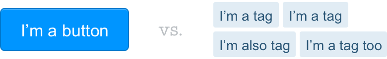
For example, when we launched our design system, someone asked if they could use the code for buttons to make tags. It’s reasonable enough, they’re both a bit of text in a colored box, right? But not only was the design slightly different, but tags are usually included lists that need to be spaced out and wrap onto multiple lines, and that’s not something buttons were set up to do. When we heard this feedback, we realized we needed a proper email component for tags. We included it in V2.
Lesson 5: Documentation
Another flaw in human character is that everybody wants to build and nobody wants to do maintenance. – Kurt Vonnegut
Documentation is the most important part of a design system. There, I said it. A design system lives and dies by its documentation. The best design systems not only cover the what, but also how, when, and why of design, remember?
Building design components without documentation on how to use them is like dumping a bunch of IKEA parts on a table and saying “Ok now build your bookshelf!”
We learned this the hard way.
We have a product offering called Stack Overflow for Teams, a private version of Stack Overflow that companies can buy. We designed an email template specifically for our Stack Overflow for Teams product, but we didn’t really document how it should be used. Our documentation just said “use for teams.”
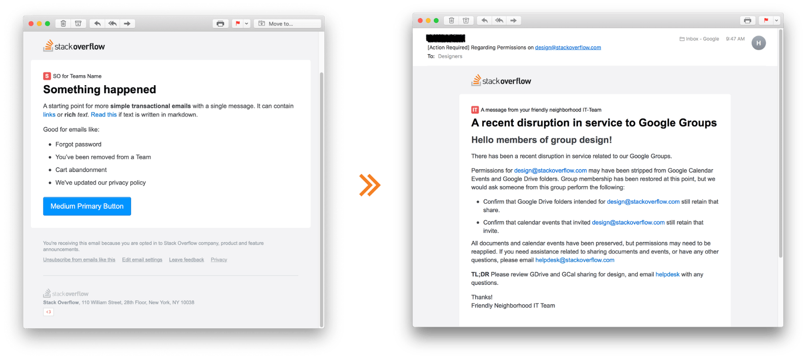
Imagine my reaction when I got an email from our own IT Department who’d used the template to send a company-wide email about our Google Groups account. Our own internal team had interpreted “teams” as “my team name on the org chart.” A perfectly valid interpretation since we skimped on the template’s documentation. Oops!!
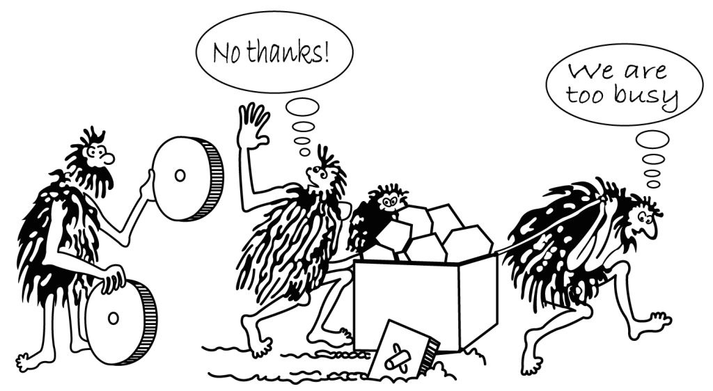
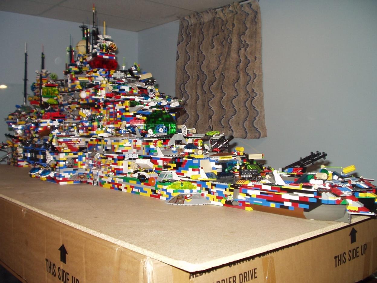
This has since been fixed, but we learned that incomplete or outdated documentation can lead people to using things for the wrong reasons. I mentioned how design systems are often compared to legos. Building blocks can be combined to build any number of things. But if legos are provided without instructions, eventually someone’s gonna think this is a good idea:
If something’s not documented at all, it may as well not exist and you run the risk of people writing new but duplicate code.
When building design systems, get into habit of documenting early. You’re building a system and that cannot work if the system is you. – Karri Saarinen
Good documentation helps promote new components, reduces the need to write new code, and helps with implementation. It’s worth investing time in developing practices that help you keep updated documentation. Here are a few we try to stick to:
- Document as you go. It’s helpful to note things you explored that didn’t make it into the finished product, as well as any notable discussions you had while creating a component. When this is documented, it helps everyone better understand the context for each component.
- Use real-time, collaboration tools like Google Docs or Dropbox Paper. These tools are geared towards co-authoring and offer a single-source of truth. Resist the Microsoft Word mandate. Local copies mask who’s changing what, suggestions and discussions aren’t always visible, and they sometimes crash.
- You probably don’t write that well. I definitely include myself in that statement. That doesn’t mean you shouldn’t write, but having a second set of eyes edit your work is ideal.
- Documentation is not just words. It can also includes things like diagrams, responsive states, device previews, interactive demos, animations, and anything else that can help get your point across.
As docs grow, a design system becomes a record of shared knowledge, accessible to everyone. No more asking “the email person” the same questions or having the same debates over and over again. Ideally, it’s all in the docs.
ME: Here’s how I make buttons. COWORKER: Great! Hey does this other, simpler way work too? ME: No of cours… ME: (researches) ME: Actually… yes…
Writing documentation also made me challenge a lot of assumptions I’d been carrying around in my head for too long. I have the discussion above once every few months, where someone asks a seemingly innocent question that just blows up my world (for the better). So documentation truly helps everyone, from the new hire who’s ramping up to the seasoned professional who thinks they know it all.
Wrapping up
Since launching our design system, I’ve seen folks with little email experience building some pretty nice emails on their own. We still have a lot to do, but we’re already seeing our email design system fulfilling its purpose.
“One of the biggest impacts is people being able to get further without design help. […] It doesn’t mean you don’t need a designer — it’s just that other team members can get further than they could before.” — Diana Mounter
Design should be collaborative, an email design system’s goal isn’t to eliminate the need for a designer. It’s also not to make all emails look the same.
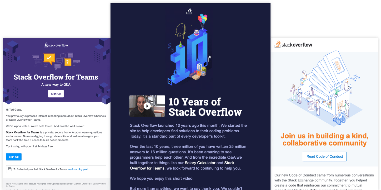
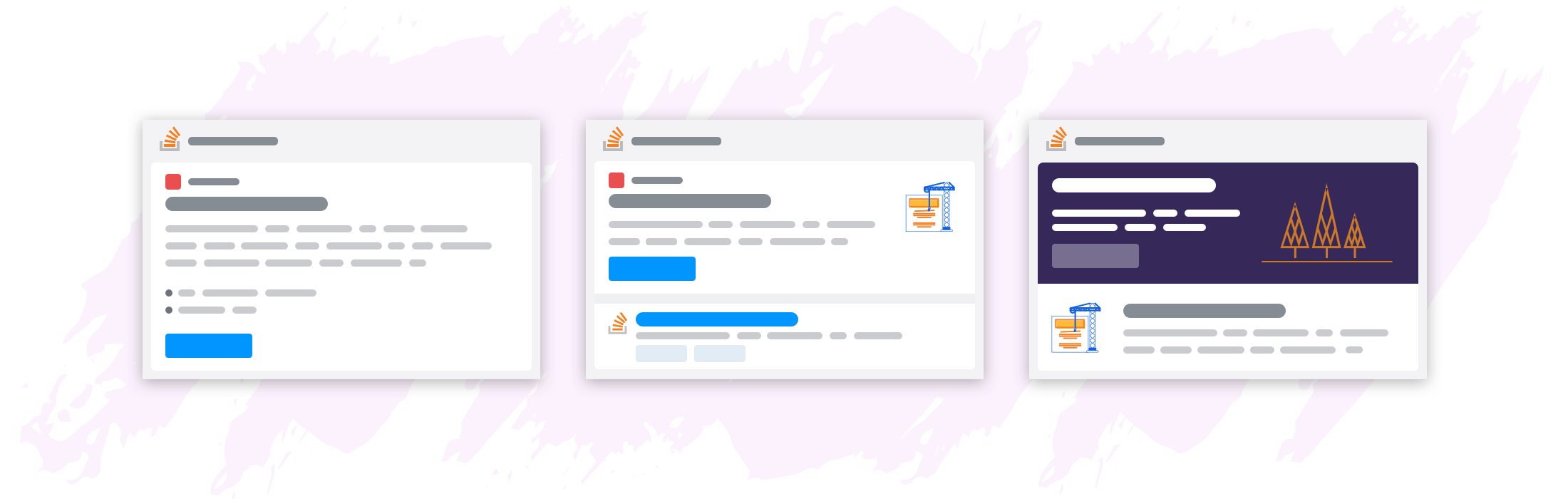
Here ☝️ are a few emails we sent last year for major announcements. We didn’t use one of the starter templates I showed earlier, but they all use components from the email design system and were relatively quick to design and test.
One thing I love about this industry is how we openly share stories like this about our work. That’s why I wanted to talk through how we approached our email design system, the decisions we made, and how we’ve been working through the difficulties we’ve encountered.
This is my experience.
If I can leave you with some parting words: Be inclusive. Welcome people into your work. Don’t overcomplicate things. Open Source if you can. #emailgeeks have a lot to share. We’ll all be a better community for it.
If you’re interested in chatting about your experience (and struggles), ping me on Twitter or message me on email geeks chat!
Special thanks to Piper, balpha, Aaron, Josh, Courtny, Elaine, and Kristina for help with our email design system and this article.
Also published on Medium