
Notes from My JerseyScript Talk on Responsive Email
These are my notes from my talk about responsive email workflow and front-end tools, from jerseyscript on May 13th 2014.
I work at Canfield in New Jersey, where I'm a designer and front-end generalist. I spend most of my time building medical apps and sites. But I also handle my company's email design and development, where we’ve been doing responsive emails for about a year.
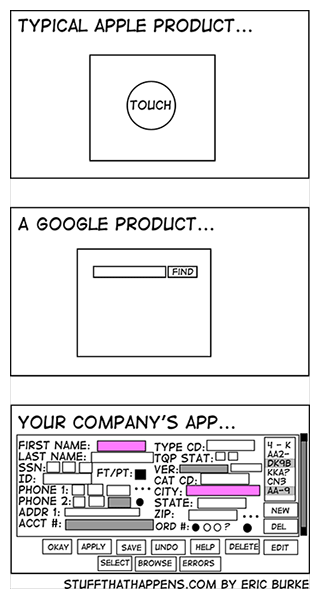
So, HTML email; often viewed as a thankless job of handwriting an endless list of nested tables styled with inline CSS and the occasional deprecated HTML tag. Not a very attractive topic. So why do I spend time with HTML email?
Emails have been a part of every job I’ve had since about 2007. I usually work on small teams where folks wear multiple hats, and emails have been always something that needed to be done. I started with “I’ll take a crack at email” and progressed to “I have experience with email” and eventually go to “I’m pretty good at email”.
Until recently, email involved writing archaic, messy markup. But in the last year or so, email has gotten a little more interesting with the responsive design and newish front-end tools.
Responsive Email Code
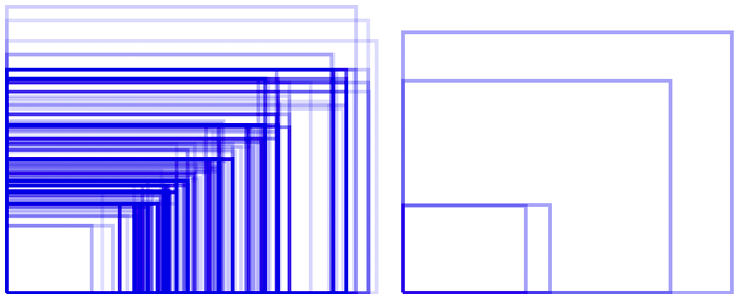
So, we all know what responsive is, right? On column on mobile... and three on wide. Responsive email is not really any different.
/* Force table cells into full width rows */
td[class="force-row"] {
    display: block !important;
    width: 100% !important;
}
These few lines of CSS are the workhorse of my responsive emails. At a certain breakpoint, the email width and images become fluid, and this class stacks table columns into full width rows. This is what makes my responsive emails go.
I could talk about responsive email patterns and CSS gotchas all night, but it’s not the code I want to talk about. When I started writing responsive emails, I noticed a few things starting to happen.
The Fold is Back
So the web version of “the fold” is has largely been debunked, right? #hotdrama. Whatever. But phones are much closer to one another than desktop displays. I have a tiny device lab of popular phones, and even on Androids, the fold line usually falls around the same place. So old discussions about content appearing “above the fold” were renewed.
And this constraint was actually a blessing in disguise...
Small Screens Force a Content Audit
At my job, I used to get creative briefs containing long passages of text and a kitchen sink of products. I’d say “We can build this, I just don’t know how it’s going to look like when we’re done.”
We always said that we’d audit our email content, be less verbose, and focus on a small number of things in each email. But it never happened. Folks would review emails on their large screen desktop on a fast connection and give a thumbs up.
Then we started testing our emails on phones.
Once people began opening our emails on their phone, they realized that an email with 30 links is on the wrong side of history. They finally felt the pain. And we finally got our content audit.
Email Workflow Grows Up
The beginnings of responsive email happened during a golden era in terms of front-end development. And email developers benefited.
Folks have incorporated things like HAML, CSS preprocessors, and Grunt into their workflow. CSS inliners allow us to write CSS like we do on the web. Others automate monotonous email checks like appending tracking parameters to every link. Litmus is working on an editor made for emails, with things like live-reload and device previews baked right in.


The resulting email code is still pretty messy, but the way we author emails is becoming much less painful. The annoying parts are getting automated and testing is getting quicker.
On top of that, people are actually experimenting to with email now. In addition to responsive layouts, folks are making emails with CSS animations, SVG, custom web fonts, and video backgrounds. I’ve never seen such enthusiasm with email design and development. Email design even got it’s first ever conference last year.
Conclusion
Building emails isn’t as terrible as it used to be and the community is better than it’s ever been. So if an email project comes across your plate, instead of jumping into a volcano, maybe it’s worth taking a look.