
Designing for Medical
I've been designing in the medical industry since the summer of 2010. When I joined Canfield Scientific, I was excited to help create apps in an industry that's underserved by the design industry.
Up to that point, though, everything I'd worked on was consumer based, focused on solving relatively ubiquitous problems for large groups of people. I soon realized that while some things translate well, in other respects it’s a completely different ballgame.
This article explains how my team works and my experience in designing for medical.
Our Tooling and Workflow
When it comes to data, we can’t make mistakes. Period. Data privacy and security lead everything we do. We're audited by the U.S. government (FDA) and comply with both HIPAA (U.S.) and Safe Harbor (E.U.) laws. We're responsible for our data's privacy and security, and must be able to produce an audit trail at a moment's notice. We can't trust our data to just anyone.
Unfortunately, this rules out most third party tools that require us to put information on someone else's server. DropBox, GitHub, Basecamp, Google Drive, Invision... just to name a few, are all off limits. Bummer. Instead we rely on self-hosted email and a few homegrown systems for things like file sharing and bug tracking.
Privacy guidelines also make it hard to share my work outside the company. I design with real data (so awesome!), but have to sanitize it before posting anything dribbble or my portfolio. I can't promote a product or even specify what it does because Canfield could be held accountable for my words. Because there are so many obstacles, I don't share my work publicly very much. Bummer numero dos.
We Design for Clarity
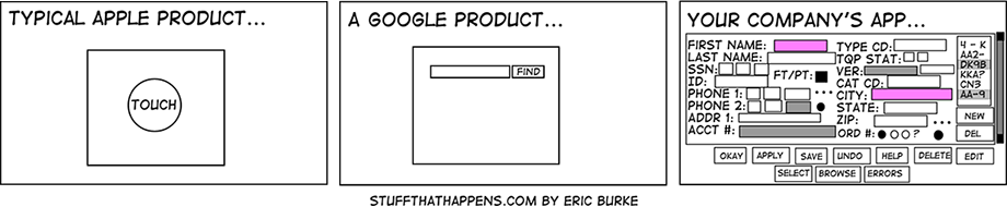
The industry also impacts how we prioritize things when thinking about design. Most of our apps allow people to organize and examine medical data in various ways. Data can be images, videos, text, or (usually) a combination of the three. Regardless of what form the data takes, clarity and accuracy are more important than cleverness and brevity.
Clarity over cleverness
We strive to design interfaces so that users know exactly what they’re looking at. Text is our primary tool for both description and action (mostly verbs). It’s precise in a way that icons and imagery can’t be. As our commit message can attest, we’re big fans of wordsmithing. Some of our interfaces might seem cluttered, but our users are able to navigate them because they know the lingo.
Accuracy over brevity
In the spirit of accuracy, data is usually presented in it’s entirety. We don’t crop, abbreviate, truncate, or reorder content for the sake of aesthetics. Worst case: we're accused of misrepresenting data. But usually it just means the app gets populated with a few long strings of text and images that don't line up perfectly. Sure it bugs me to see that, but I'm not the customer.
One-Off Requests Are A Thing
How to make terrible software:
1. Make promises for one-off features for a single client
2. Implement them
3. Repeat
— Ryan Florence (@ryanflorence) July 25, 2012I love this quote, but unfortunately it doesn’t carry much weight in our world. Many clinical trials are different from one another and doctors often have their own way of running their practice, so we’re frequently asked to adapt our apps or create a special feature that benefits only a small number of users.
"Yea sure, we'll get right on that..." a product manager might think with a hint of sarcasm.
But here's the rub: Compared to consumer-focused products, we have a small number of large customers. If we lose business because we turn down special requests, it hurts. So we listen and sometimes build a feature that we don’t fully understand. Our willingness to do this keeps customers coming back with the confidence that we'll make what they need. I imagine this is similar to building for enterprise clients.
Everything is an Option
A by-product of catering to requests like this is a large, carefully engineered product with lots of features and options. Most of our interfaces are configurable, either by user preference or permission level. Each option makes each interface more unpredictable. Depending on what's enabled, a single screen can take many forms. It's a challenge to design interfaces flexible enough to handle every scenario. In Internet Explorer.
Apple philosophy: It’s only done when you can’t remove anything else.
Android philosophy: Every bell and whistle marginally adds value.
Yeah, we're Android.
The Technology Landscape is Vast
Many of our clients have a conservative attitude towards technology upgrades. Internet Explorer rules the browser landscape for our flagship clinical web app, dwarfing Chrome and Firefox. One of our largest customers still uses Internet Explorer 7. We see more pages sent to the printer than viewed in Safari (Go ahead, ask me about print style sheets). Some weeks, the only Macintosh OS that pops up in our analytics is me.
Conversely, iOS rules our mobile landscape.
To ensure no one is left behind, our team leans towards progressive enhancement. Poor type rendering and laggy browser performance aside, it's not so bad. Sorta like building mobile-first: start with the lowest common denominator and build up.
And then there’s email design. Outlook Express appears in our email metrics. Don’t get me started on email.
It's Incredibly Lonely
This part is what made me write this in the first place.
Designing in such a private, specialized industry is lonely. It's hard for me to feel like part the design community when I don't build stuff for my peers. I have a hard time explaining my work, and even when I do, folks don't always understand. I rarely receive helpful feedback from designers outside my team.
Thoughtful Design is Appreciated
Ok enough with the bad! There's a lot of upside to working in the medical space. This is an underserved market. At the risk of sounding cliché, it's ripe for disruption.
Our clients are usually impressed by our design efforts. A few basic things go a long way, things like:
- thoughtful I.A. (instead of jamming every link in a mega drop-down menu).
- a typographic hierarchy (instead of 12px Arial everywhere).
- a color palette (instead of defaulting to black, white, and blue).
I’m surprised how many of our competitors don’t put much effort into their software’s organization and presentation. I wonder how many of them even employ in-house designers.
This is an easy win.
The Work is Meaningful
As designers, we're fortunate to be able to work in almost any industry. I've helped sell everything from real estate to diapers. But none of it compares to helping people with their health. Last year, we helped execute a clinical trial to cure Dystrophic Epidermolysis Bullosa, a genetic tissue disorder that causes skin to blister and flake just by touching it. We're also involved in projects like Operation Smile, which helps repair facial deformities for children.
I mean, not everything I work on has a strong sense of meaning. My first project involving plastic surgery was kind of a bummer. First world problem, I thought. But I realized that people would always be making major decisions about their body with or without good data, so why not use software to improve the information they use to make those decisions?
And of course, not everything I work on is exciting. Like fixing bugs in IE 7 or integrating with legacy software found in so many doctor offices. But this work needs to be done. I've embraced the boredom and made it a strength: I can work on a big serious problem at Canfield or go work with the other guys.
Wrapping Up
So that's it. Despite it's drawbacks, I'm tremendously proud to be in this field and helping people make better decisions about their body. We don't use the latest web tools or design bleeding-edge interfaces. But that's fine, because:
And in this industry, shit doesn't always just work. That's what my team is working on.
P.S. We're hiring