The Best Design Things I Read in 2017
A small collection of articles that stuck out in my mind this year.
Tips for Becoming a Design Leader
I thought about design leadership a lot in 2017. I wrote about it too. I enjoyed Andrew’s story about how he transitioned from an individual contributor to a design manager at Facebook; very relatable to any mid-senior level designer contemplating their step career step.
The Five-Tool Designer
Mike Davidson briefly describes five traits he looks for when hiring designers. I particularly enjoyed the paragraph about (surprise surprise) leadership. A short and solid article explaining how design is about people just as much as it is about pixels. Oh, and there’s a highly contentious sixth trait at the end of the article (that I agree with).

Accessibility According to Actual People with Disabilities
So many accessibility posts concentrate on designing for screen readers and folks with vision disorders. This post contains quotes from actual people with disorders like ADHD, autism, dyslexia, and hand tremor (not your garden variety disorders). Reading it was a real eye opener and changed the way I think about the accessible web.
Making Remote Work
I work for Stack Overflow, a company that’s massively ahead of the curve in terms of work-life balance and policies for remote employees. But a first-in-class remote culture doesn’t just happen, it takes a lot of work. This article talks about how we pull it off.
Design Systems are for People
Ever try to convince folks at work why it’s worth the time and effort to have a design system? That it will help you ship product faster? But those folks would prefer you just stay focused on the product? I certainly have been there.
Design Systems are #sohot right now, but getting buy in to make one for your company or client isn’t always easy. Jina tells a wonderful story about why it’s worth it to invest in how you build products even when the fruits of your labor won’t be immediately apparent.
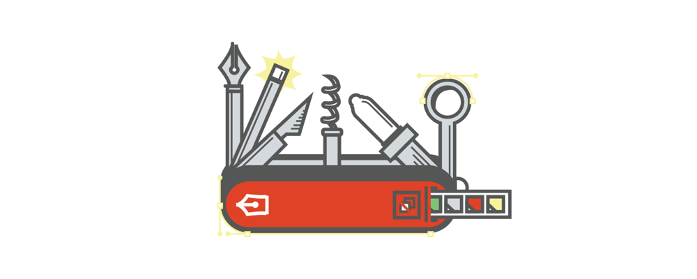
The Full Stack Design System
Your product is more than just a pile of reusable UI elements. It has structure and meaning. It’s not a generic web page, it’s the embodiment of a system of concepts.
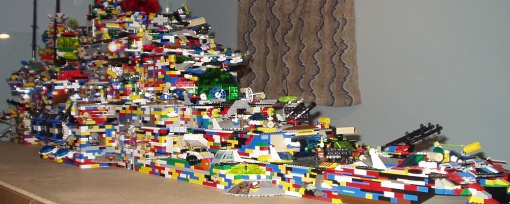
Many Design Systems are really just Pattern Libraries: a big box of UI Lego pieces that can be assembled in near-infinite ways. But you don’t want to end up with something like the photo above. Combining these design patterns effectively is just as important as building them in the first place.
Ignorance Got a Bad Rap
Compared to other industries, people in tech tend to share quite a bit. Blog posts, conference talks, github, podcasts, dribbble, twitter, the amount of information we share with each other is overwhelming.
It’s tempting to soak up every piece of advice and data on any given idea, but ultimately that can be paralyzing and prevent ideas from being approached with a beginner’s mind. Reminds me of a comment from Mike Davidson:
Instead of meeting each new challenge with an open mind and fresh enthusiasm, he let his past experiences limit his creativity and his positive outlook.
A Designer’s Guide to Competitor Research
Product Designers have to cover a lot of ground and research wasn’t one of my strongest skills coming into 2017. With the guidance of a few co-workers and and a few articles like this one, I leveled up my research skill this past year. Wayfair’s design team put together an excellent overview of how they conduct research and present findings; great for any beginner looking to improve their research skills.
Raising Our User Experience Design Bar
At Stack Overflow, product designers write their own functional specs before opening Photoshop or Sketch. I really like Creative Market’s idea of a UX Plan as an essential parts of product specs.
In essence, it’s a plan for what states require wireframes and/or comps, and the content and interactions that should be designed for…
It’s cheaper to brainstorm and collaborate in a Google Doc than in Sketch. Spending time upfront in writing a UX plan saves a ton of design time down the line.
Designing for a Data-Heavy Platform
There is a strong trend of reducing complexities in design. That works in consumer apps with single and simpler goals. But when you are designing for enterprise products, you cannot reduce the number of features or simply do away with complex use cases.
This ^^ has been my reality for the last several years, but that doesn’t mean that complex screens can’t be well designed. This case study shows how WebEngage redesigned a product that supports elaborate use-cases and extensive features.

What I Learned Helping Blue Apron Grow 25X in 3.5 Years
Decide where you sit on the “speed vs. polish spectrum.”
Invest in first-time people managers — you’re going to have a lot of them.
“Common sense judgment” will stop scaling.
Melody Koh tells the story of how Blue Apron grew from a small startup to a mature company and shares a few insights learned from the growing pains that occurred along the way.
Bonus: Vague But Exciting
Technically this isn’t something I read, but this might be the best conference talk or podcast episode I listened to this year. Dave Rupert talks about video games, why the term “minimum viable product” is 🙄, and how to design something with more than 5 people and have it not go to shit.
2017 was another great year of folks being generous with their time and knowledge. Y’all continue to make me a better designer, employee, and person; thank you!
Also published at https://medium.com/@tedgoas/the-best-design-things-i-read-in-2017-2c53c969fb0c